Blog Summary
Product variants allow online stores to sell different versions of the same product, such as sizes, colors, materials, capacities, or configurations. When variant options are clearly presented and logically connected to product availability, customers can make more accurate choices. Poor variant design, unclear labels, confusing size charts, and unavailable combinations can lead to ordering mistakes, returns, and customer frustration.
Quick Answer / Featured-Snippet Answer
E-commerce product variant selection reduces shopping errors by clearly presenting available sizes, colors, configurations, and other product options. Accurate labels, usable size charts, clear visual indicators, dependent option logic, variant-specific images, and visible availability help customers select the correct product before adding it to the cart.
Introduction
A product may appear simple on an online store while actually having dozens of possible combinations. A shirt can have multiple sizes and colors, a laptop can have different RAM and storage configurations, and a chair may be available in several materials and finishes. When these options are not presented clearly, customers can select the wrong variant without realizing it. The problem becomes more serious when different options affect price, availability, images, delivery, or product specifications. E-commerce product variant selection should therefore be designed as part of the purchasing experience rather than treated as a simple collection of dropdowns. Customers need to understand what choices are available, which combinations can actually be ordered, and how each selection changes the product. A clear variant interface can reduce avoidable mistakes while making product comparison and purchase decisions easier.
What Is E-commerce Product Variant Selection and Why Does It Matter?
E-commerce product variant selection is the process through which customers choose a specific version of a product before adding it to their cart.
Variants can include:
-
Size.
-
Color.
-
Material.
-
Capacity.
-
Storage.
-
Configuration.
-
Finish.
-
Pack quantity.
-
Model.
-
Product version.
For example, a laptop may have:
RAM: 8 GB / 16 GB / 32 GB
Storage: 512 GB / 1 TB
These choices can create several purchasable configurations.
The website must communicate which combinations exist and which are unavailable.
A good variant selector answers three questions immediately:
What options are available?
Which option is currently selected?
What happens when I select it?
Why Clear Product Options Matter
Online product option clarity helps customers understand exactly what they are purchasing.
Consider a product page showing:
Color
○ Option 1
○ Option 2
○ Option 3
The customer has no meaningful information about what those options represent.
A clearer interface might show:
Color
● Black
○ White
○ Navy Blue
For visual products, color swatches can provide an additional visual reference.
The selected state should also be obvious so customers do not accidentally purchase a different option from the one they intended.
Product Size Selection Guide
A product size selection guide should help customers choose a size using information relevant to the product.
A basic size selector such as:
Size
S
M
L
XL
may not be sufficient for all products.
Customers may need measurements such as:
|
Size |
Chest |
Waist |
Length |
|
S |
36 in |
30 in |
27 in |
|
M |
38 in |
32 in |
28 in |
|
L |
40 in |
34 in |
29 in |
|
XL |
42 in |
36 in |
30 in |
The actual measurements should always come from the product's manufacturer or the store's verified sizing information.
A useful size guide should also explain how customers should measure themselves when that information is necessary.
Product Size Chart Usability
Product size chart usability is about how easily shoppers can understand and apply sizing information.
A size chart should not require customers to leave the product page, search another section, or interpret unexplained measurements.
Useful design practices include:
-
Keeping the size guide close to the size selector.
-
Using familiar measurement units.
-
Explaining how measurements are taken.
-
Clearly identifying product-specific sizing.
-
Making the chart readable on mobile devices.
-
Avoiding unnecessarily complicated tables.
If a product uses a non-standard sizing system, the website should explain it rather than assuming customers already understand it.
Color Variant Display in Online Stores
Color variant display in online stores should make differences between available colors easy to recognize.
Text labels are important, but visual swatches can provide additional information for products where color strongly influences the purchase.
For example:
Color: Black
● Black
○ White
○ Brown
○ Grey
Each option should have a clear accessible label.
For colors that look visually similar, text labels become particularly important.
Businesses should also ensure that selecting a color changes the corresponding product image when appropriate.
This allows customers to verify that they are viewing the correct variant.
Variant-Specific Product Images
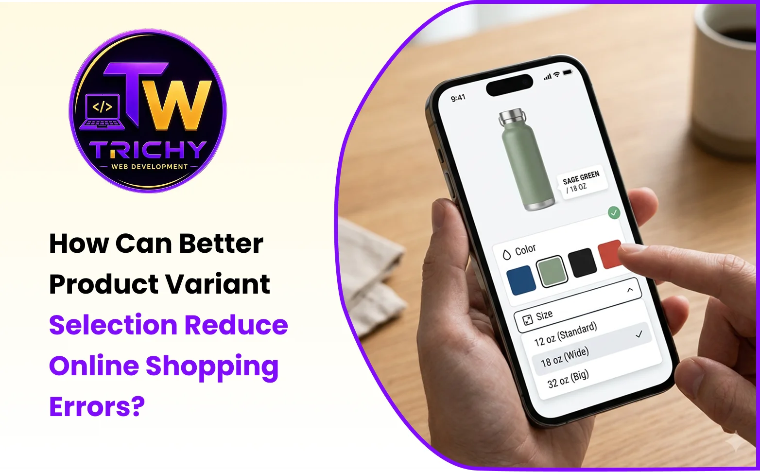
Product imagery and variant selection should work together.
Suppose a customer selects:
Color: Green
but the primary product image continues showing the red version.
The customer may wonder whether the selected variant actually changed.
A better experience updates the relevant product image when the selected variant changes.
For products with significant visual differences between variants, this can be especially useful.
The image should reinforce the selected option rather than create uncertainty.
Product Variant Selection Errors
Product variant selection errors can happen when customers misunderstand options or when the interface does not clearly communicate the current selection.
Common examples include:
-
Selecting the wrong size.
-
Selecting a similar-looking color.
-
Missing an unavailable combination.
-
Adding the default variant without realizing it.
-
Choosing one option but seeing another image.
-
Selecting a configuration with a different price without noticing.
-
Adding the wrong variant to the cart.
These errors can eventually lead to returns, exchanges, support requests, and customer dissatisfaction.
Dependent Variant Logic
Some product options depend on one another.
For example:
Color → Size → Availability
Suppose a red shirt is available in S, M, and L, while the blue version is available only in M and XL.
If the customer selects blue, the website should update the available size choices.
It should not allow the customer to select an impossible combination and discover the problem only after clicking Add to Cart.
This is where dependent variant logic becomes important.
The interface should communicate:
Available
Unavailable
Selected
and, where useful, Out of Stock.
Showing Unavailable Variants Clearly
Unavailable options should not create unnecessary confusion.
The website can visually distinguish unavailable choices while keeping them understandable.
For example:
Size
S M L XL
✓ ✓ — ✓
A customer should understand that the unavailable option exists but cannot currently be purchased.
In some situations, selecting another option may make that variant available.
The interface should update dynamically where appropriate.
Price Changes Between Variants
Some variants have different prices.
For example:
500 ml — ₹299
1 litre — ₹499
The price displayed on the product page should update when the customer changes the relevant variant.
Otherwise, customers may believe they are purchasing one version at one price and discover a different amount later.
The selected variant, displayed price, and cart information should remain synchronized.
This is especially important when variant differences affect the total order value significantly.
Inventory and Variant Selection
Inventory should be connected to variant choices where applicable.
Consider:
Color: Black
Size: M
If that exact combination is unavailable, the website should communicate it.
Inventory should ideally be managed at the variant level rather than only at the parent-product level when each combination has independent stock.
This prevents customers from selecting a technically valid product combination that cannot actually be fulfilled.
A CHOOSE Framework for Better Variant Selection
Businesses can evaluate their variant experience using the CHOOSE framework:
C — Clarify Options
Use descriptive names and clear visual states for every available variant.
H — Highlight Selection
Make the currently selected option immediately recognizable.
O — Organize Variants
Group related options logically, such as size, color, material, and configuration.
O — Offer Accurate Information
Keep images, prices, specifications, and availability synchronized with the selected variant.
S — Simplify Combinations
Prevent customers from selecting impossible or unavailable combinations.
E — Explain Choices
Provide size charts, measurement guidance, color labels, and other supporting information where necessary.
This approach treats variant selection as an information-design problem rather than simply a form-control problem.
Mobile Variant Selection
Variant selection can become particularly difficult on mobile devices because the available screen space is limited.
A mobile product page should make it easy to:
-
Identify the selected variant.
-
Change options.
-
Read size information.
-
View variant-specific images.
-
Understand availability.
-
See price changes.
-
Add the selected version to the cart.
Large enough controls and clear spacing can reduce accidental taps.
A size chart should also open in a mobile-friendly format rather than requiring customers to zoom into a desktop-sized table.
How Variant Selection Affects Returns
Incorrect variant selection can contribute to preventable returns.
For example, a customer may order the wrong size because:
-
The size chart was difficult to find.
-
Measurements were unclear.
-
The product used unfamiliar sizing.
-
The selected size was not visually obvious.
-
The website allowed an unavailable combination.
-
The product image did not update with the selected color.
Improving the selection interface does not eliminate all returns, but it can reduce errors caused by unclear information or poor interaction design.
Practical Example: Clothing Store
Imagine an online clothing store selling a shirt in four sizes and five colors.
The product page could provide:
Color: Black / White / Navy / Green / Beige
Size: S / M / L / XL
When a customer selects Navy, the main product image changes to the navy version.
When the customer selects XL, the availability indicator updates.
A nearby size-guide link opens measurements for that particular product.
The price remains visible, and the selected color and size are clearly displayed above the Add to Cart button.
The cart then records:
Navy — XL
This gives the customer several opportunities to verify the purchase before submitting the order.
Common Product Variant Mistakes
One common mistake is using vague variant labels that do not clearly describe the option.
Another is allowing customers to select combinations that are not actually available.
Failing to update product images when a visual variant changes can also create uncertainty.
Some stores hide the size chart too far away from the selector, forcing customers to search for important information.
Another problem is showing a selected option with almost no visual difference from unselected options.
Businesses should also avoid assuming that customers understand industry-specific sizing or terminology.
Best Practices for Product Variant Selection
Use clear labels for all variants.
Make the selected option visually obvious.
Connect variant choices to real inventory.
Update product images when visual variants change.
Update prices when different configurations have different prices.
Show unavailable combinations clearly.
Provide product-specific size charts where sizing matters.
Use consistent terminology across product pages.
Make variant controls easy to use on mobile.
Display the selected options near the Add to Cart action.
Validate the selected variant before adding it to the cart.
Make sure the cart and order confirmation display the exact selected variant.
Product Variant Selection Checklist
Before launching an online store, review whether:
-
All product variants are clearly named.
-
Selected options are visually distinct.
-
Color choices use clear labels and appropriate swatches.
-
Product images update when necessary.
-
Size charts are easy to access.
-
Measurements are explained clearly.
-
Variant availability is accurate.
-
Invalid combinations cannot be purchased accidentally.
-
Variant-specific prices update correctly.
-
Inventory is connected to the correct variant.
-
Mobile controls are easy to operate.
-
Selected options are visible before adding to cart.
-
Cart and checkout display the selected variant accurately.
How E-Commerce Website Development Supports Better Variant Selection
Product variants require coordination between product data, inventory, frontend controls, images, pricing, cart functionality, and order processing.
A properly developed e-commerce website can connect these elements so that a customer's selected option remains consistent from the product page through checkout and order confirmation.
For businesses selling products with multiple sizes, colors, configurations, or specifications, Trichy Web Development can support e-commerce website development with product catalogs, variant functionality, responsive interfaces, inventory-related workflows, and other online store features.
Conclusion
Better product variant selection helps online stores reduce avoidable shopping errors by making product choices clearer before customers commit to a purchase. Size, color, material, configuration, availability, pricing, and product imagery should work together rather than functioning as separate elements. Clear labels, usable size charts, visible selected states, dependent variant logic, accurate inventory, and variant-specific images can give customers greater confidence that they are ordering exactly what they intended. Businesses should also test variant selection on mobile devices and verify that the selected option remains accurate from the product page through checkout. When thoughtful product-option design is combined with reliable e-commerce development, online stores can create a more predictable purchasing experience and reduce confusion caused by incorrect or unclear variant selections.